The Genius of Helvetica: Why This Simple Font Took Over Everything
Take a look around you for a moment. There's a good chance you're surrounded by Helvetica. It might be on a book cover, the label of your water bottle, or even the street signs in your neighborhood. Helvetica, a minimal yet effective sans-serif font, has become ubiquitous in our modern world. But what is it about this simple typeface that's led to such global domination?
Born from Neutrality:
In 1957, Swiss typeface designer Max Miedinger worked on developing a clean, neutral font for Haas Foundry alongside the foundry’s president Eduard Hoffmann. They based this new font on an existing typeface called Akzidenz-Grotesk, pushing for improved legibility and a minimalist approach that would work across languages. This neutrality became its greatest strength.
Versatility for Every Voice:
Helvetica's clean aesthetic and lack of ornamentation made it ideal for a world increasingly reliant on clear communication. Helvetica’s legibility at the time was a breakthrough for clear, concise way-finding systems like airports and New York’s subway system. It could be bold and authoritative on a government poster, yet friendly and welcoming on packaging. Brands from IBM to The North Face saw its versatility, using Helvetica to convey professionalism, modernity, and accessibility.
Wes hicks | Unsplash
Hidden in the Details:
The beauty in Helvetica is not just it’s letterforms, but also in use of the negative space and counter shapes within the letterforms. Other unique attributes are the horizontal slicing of terminals as seen in the lowercase “e”.
A Font for a Technological Age:
The rise of computers and digital displays further cemented Helvetica's place. Its simple geometric forms translated perfectly to the pixelated screens of early computers. As technology advanced, Helvetica remained a reliable choice, continuing to be easily readable on everything from tiny smartphone screens to massive billboards. Eventually, the type foundry Monotype needed to adjust attributes of the font because it was proving difficult to read on the smallest screens like smart watches. This adjustment lead to the updated version known as Helvetica Now.
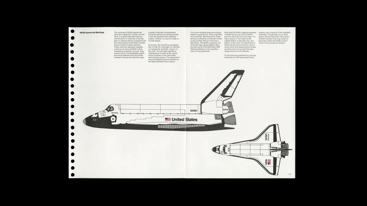
Danne and Blackburn
The Legacy of Helvetica:
Helvetica's influence extends far beyond logos and branding. It's a testament to the power of good design – thoughtful, functional, and able to seamlessly integrate into the background of our lives. Whether you love it or take it for granted, there's no denying the genius of Helvetica, a simple font that quietly took over the everything.


